
SO40CH05-MoodyHealy ARI 4 July 2014 13:29
Data Visualization
in Sociology
Kieran Healy and James Moody
Sociology Department, Duke University, Durham, North Carolina 27708;
Annu. Rev. Sociol. 2014. 40:105–28
First published online as a Review in Advance on
June 6, 2014
The Annual Review of Sociology is online at
soc.annualreviews.org
This article’s doi:
10.1146/annurev-soc-071312-145551
Copyright
c
⃝ 2014 by Annual Reviews.
All rights reserved
Keywords
visualization, statistics, methods, exploratory data analysis
Abstract
Visualizing data is central to social scientific work. Despite a promising
early beginning, sociology has lagged in the use of visual tools. We
review the history and current state of visualization in sociology. Using
examples throughout, we discuss recent developments in ways of seeing
raw data and presenting the results of statistical modeling. We make a
general distinction between those methods and tools designed to help
explore data sets and those designed to help present results to others.
We argue that recent advances should be seen as part of a broader shift
toward easier sharing of code and data both between researchers and
with wider publics, and we encourage practitioners and publishers to
work toward a higher and more consistent standard for the graphical
display of sociological insights.
105
Annu. Rev. Sociol. 2014.40:105-128. Downloaded from www.annualreviews.org
Access provided by Duke University on 08/09/17. For personal use only.
Click here for quick links to
Annual Reviews content online,
including:
• Other articles in this volume
• Top cited articles
• Top downloaded articles
• Our comprehensive search
Further
ANNUAL
REVIEWS
SO40CH05-MoodyHealy ARI 4 July 2014 13:29
INTRODUCTION
From the mind’s eye to the Hubble telescope,
visualization is a central feature of discovery,
understanding, and communication in science.
There are many different ways to see. Visual
tools range from false-color photographs of
telescopic images in astronomy to reconstruc-
tions of prehistoric creatures in paleontology.
In the statistical sciences, images are often more
abstract than models of fighting dinosaurs—
depending asthey must onconventions that link
size, value, texture, color, orientation, or shape
to quantities (Bertin 1967 [2010]). But statisti-
cal visualizations are nonetheless critical to pro-
moting science. One need only think of the now
iconic hockey-stick diagram of earth tempera-
ture for a clear case (Mann et al. 1999). De-
spite its ubiquity in most of the natural sciences,
visualization often remains an afterthought in
sociology.
In this article, we review the history and
current state of data visualization in sociology.
Our aim is to encourage sociologists to use
these methods effectively across the research
and publication process. We begin with a brief
history, then present an overview of the the-
ory of graphical presentation. The bulk of our
review is organized around the uses of visualiza-
tion in first the exploration and then the presen-
tation of data, with exemplars of good practice.
We also disc uss workflow and software issues
and the question of whether better visualization
can make sociological research more accessible.
SOCIOLOGY LAGS
First, why are statistical visualizations so com-
mon in other fields and rare in sociology? Al-
though model summaries offer exacting preci-
sion in expressing particular quantities—such
as the slope of a line through data points—
getting a sense of multiple patterns simulta-
neously is typically easier visually. The point is
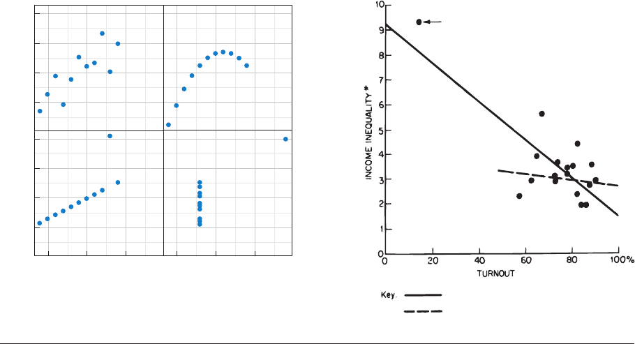
made forcefully by Anscombe’s (1973) famous
quartet, reproduced in Figure 1a.Eachdataset
contains 11 observations on two variables. The
basic statistical properties of each data set are
almost identical, up to and including their bi-
variate regression lines. But when visualized as a
scatterplot, the differences are readily apparent
(see also Chatterjee & Firat 2007). Lest we think
such features are confined to carefully con-
structed examples, consider Jackman’s (1980)
intervention in a debate between Hewitt (1977)
and Stack (1979) over a critical test of Lenski’s
(1966) theory of inequality and politics, repro-
duced in Figure 1b. The argument is won at
aglance,asthefigureshowsthattheseem-
ingly strong negative association between voter
turnout and income inequality depends entirely
on the inclusion of South Africa in the sample.
Given the power of statistical visualization,
then, it is puzzling that quantitative sociology is
so often practiced without visual referents. One
need only compare a recent issue of the Ameri-
can Sociological Review or the American Journal of
Sociology to Science, Nature, or the Proceedings of
the National Academy of Science to see the radical
difference in visual acuity. It is common for the
premier journals in sociology to publish articles
with many tables, but no figures. The opposite
is true in the premier natural science journals.
There, a key figure is often the heart of the ar-
ticle. In Nature,forexample,theonlinetable
of contents includes a thumbnail of the central
figure to serve as the link to the rest of the paper.
It has not always been so. Early in the history
of the discipline, data visualizations were com-
mon and not appreciably out of step with the
wider scientific community. Exemplars of bar
charts (Hart 1896), line graphs (Marro 1899),
parametric density plots and dot plots with
standard errors (Chapin 1924), scatterplots
(Sletto 1936), and social network diagrams
(Lundberg & Steele 1938) are easy to find in
early sociological journal articles. Du Bois’s
(1898 [1967]) The Philadelphia Negro is filled
with innovative visualizations, including choro-
pleth maps, table-and-histogram combinations,
time series, and others. But somewhere along
the line sociology became a field where sophis-
ticated statistical models were almost invari-
ably represented by dense tables of variables
along rows and model numbers along columns.
Though they may signal scientific rigor, such
106 Healy
·
Moody
Annu. Rev. Sociol. 2014.40:105-128. Downloaded from www.annualreviews.org
Access provided by Duke University on 08/09/17. For personal use only.
SO40CH05-MoodyHealy ARI 4 July 2014 13:29
12
34
5.0
7.5
10.0
12.5
5.0
7.5
10.0
12.5
5 10 15 5 10 15
x values
y values
For all panels, N = 11; mean = 7.5; regression: Y = 3 + 0.5(X); r = 0.82.
SE of slope estimate: 0.118, t = 4.24; sum of squares (X − X): 100
South Africa
Bivariate slope including South Africa (N = 18)
Bivariate slope excluding South Africa (N = 17)
a Anscombe’s quartet (1973) b Jackman (1980)
Figure 1
Visualizations reveal model summary failures: (a) Anscombe’s quartet shows how statistically identical data sets can look very different;
(b) visualization from Jackman (1980) decisively demonstrates the influence of outlying data points in an analysis.
tables can easily be substantively indecipherable
to most readers and perhaps at times even to
authors. The reasons for this are beyond the
scope of this review, although several possi-
bly complementary hypotheses suggest them-
selves. First, to the extent that graphical im-
agery was thought of as descriptive, statistical
images may have been collateral damage in the
war between causal-inferential modeling and
descriptive reportage. Second, figures may have
seemed unsophisticated. The very clarity of a
(good) figure made the work seem too sim-
ple. Third, and more charitably, visualization
in sociology might have been a victim of the
field’s relatively rapid embrace of quantitative
methods. American sociology adopted sophis-
ticated modeling techniques quite early com-
pared with other social sciences. The range
and variety of its research questions and data
sources meant that the statistical tool kit in so-
ciology in the late 1960s and into the 1970s
was more varied than in economics or psy-
chology at the time and much more developed
than what was then current in political science.
But this was also a period when the visual-
ization tools of statistical software lagged well
behind their strictly computational abilities.
Conventions of data presentation may have
standardized at a time when the possibilities for
visualization were narrower. Finally, some of
the resistance to figures may have come from
the fact that the tables in early journal articles
and monographs often contained actual data
rather than summaries or model results. In a re-
view of a history of graphical methods in statis-
tics written in 1938, John Maynard Keynes re-
marked that he wished the author
could have added a warning, supported by
horrid examples, of the evils of the graphical
method unsupported by tables of figures. Both
for accurate understanding, and particularly to
facilitate the use of the same material by other
people, it is essential that graphs should not be
www.annualreviews.org
•
Data Visualization in Sociology 107
Annu. Rev. Sociol. 2014.40:105-128. Downloaded from www.annualreviews.org
Access provided by Duke University on 08/09/17. For personal use only.
SO40CH05-MoodyHealy ARI 4 July 2014 13:29
published by themselves, but only when sup-
ported by the tables which lead up to them. It
would be an exceedingly good rule to forbid
in any scientific periodical the publication of
graphs unsupported by tables. (Keynes 1938,
p. 282, emphasis added)
To speak anachronistically, here Keynes is
arguing that economists need the underlying
data along with the visual summary for the sake
of reproducibility. We are now at a point when
the volume of data used in a typical quantita-
tive article far exceeds what can be presented in
a series of tables. But Keynes’s point is worth
bearing in mind. The utility of visualization
methods—in particular their ability to effec-
tively summarize large quantities of data or so-
phisticated modeling techniques—is partly de-
pendent on related advances in our ability to
easily share data and reproduce analyses. If data
are accessible as needed, using figures instead
of tables becomes much easier. Not coinci-
dentally, this is another area where sociology
has lagged behind other social sciences (Freese
2007).
Whatever their relative importance, the net
result of these processes for sociology has been
a training and publication standard that rarely
includes graphical treatments of statistics. New
students are typically not taught to think about
graphics and statistics in a consistent, coherent
way.
Our argument is not that sociologists should
be producing more visualizations just because
everyone else is doing it. Indeed, as we discuss
below, there is considerable debate about what
sort of visual work is most effective, when it can
be superfluous, and how it can at times be mis-
leading to researchers and audiences alike. Just
like sober and authoritative tables, data visual-
izations have their own rhetoric of plausibility.
Anscombe’s quartet notwithstanding, summary
statistics and modeling can be thought of as
tools that deliberately simplify data to let us see
past the cloud of data points. We do not think
visualization will give us the right answer sim-
ply by looking. Rather, we should think about
how visualization might be more effectively in-
tegrated into all stages of our work. Software
now makes routinely generating figures easier
than ever. Even if many disciplinary journals
still lag in their editorial desire or ability to
present good data visualizations, we argue that
it is time for these methods to be fully integrated
into sociology’s research process.
VISUALIZATION IN PRINCIPLE
Book-length treatments of good statistical visu-
alization practice abound. Their content ranges
from the more theoretical—emphasizing, for
instance, the nature and origins of visual
conventions—to more pragmatic collections
of current best practices meant to serve as
an inspiration to practitioners. In between
are efforts to codify practice and develop
taste, and guides to working implementations.
The most influential general treatments are
probably Bertin’s (1967 [2010]) Semiology of
Graphics,Cleveland’sThe Elements of Graphing
Data (1994) and Visualizing Data (1993), and
Wilkinson’s (1995 [2005]) The Grammar of
Graphics. Overviews of contemporary practice
can be had in Few (2009, 2012) and Yau (2012).
There are also several books based specifically
on visualization techniques within a particular
software program, such as Friendly (2000) for
SAS, Mitchell (2012) for Stata, Murrell (2011)
for R, and Kleimean & Horton (2013) for
comparisons of multiple programs. Sometimes
the graphical capabilities of particular software
applications are loosely related to the more
theoretical work, taking from them a concern
with aesthetic principles and possibly specific
sorts of plots. In other cases , the linkage is
closer. Sarkar (2008) describes a data visu-
alization package for R that closely follows
Cleveland’s ideas (and some earlier associated
software), and Wickham (2009, 2010) describes
a s oftware package for R that implements and
extends principles worked out in Wilkinson’s
(1995 [2005]) The Grammar of Graphics.
The conceptual literature is deep and com-
prehensive, although its representatives do not
always speak in one voice. This is to be expected
in an area where theoretical development
108 Healy
·
Moody
Annu. Rev. Sociol. 2014.40:105-128. Downloaded from www.annualreviews.org
Access provided by Duke University on 08/09/17. For personal use only.
SO40CH05-MoodyHealy ARI 4 July 2014 13:29
involves judgments of taste. The best-known
critic and tastemaker by far in the field is
Edward R. Tufte. It is fair to say that The Visual
Display of Quantitative Information (Tufte 1983)
is a classic in the field, and its three follow-up
texts are also widely read (Tufte 1990, 1997,
2006). Described as “self-exemplifying” (Tufte
2006, p. 10), the bulk of the work is a series
of negative and positive examples with more
general principles (or rules of thumb) extracted
from them rather than a direct guide to practice,
akin more to a reference book on ingredients
than to a cookbook for daily use in the kitchen.
At the same time, Tufte’s early work in politi-
cal science shows that he applied his ideas well
before codifying them in this way. His Political
Control of the Economy (Tufte 1978) combines
data tables, figures, and text in a manner that
remains remarkably fresh almost 40 years later.
Across his work, Tufte preaches a consistent
set of principles, though they vary in their de-
gree of specificity. Thus,
Graphical excellence is the well-designed pre-
sentation of interesting data—a matter of sub-
stance,ofstatistics,andofdesign. ... [It] consists
of complex ideas communicated with clarity,
precision, and efficiency. ... [It] is that which
gives to the viewer the greatest number of
ideas in the shortest time with the least ink
in the smallest space. ... [It] is nearly always
multivariate. ... And graphical excellence re-
quires telling the truth about the d ata. (Tufte
1983, p. 51)
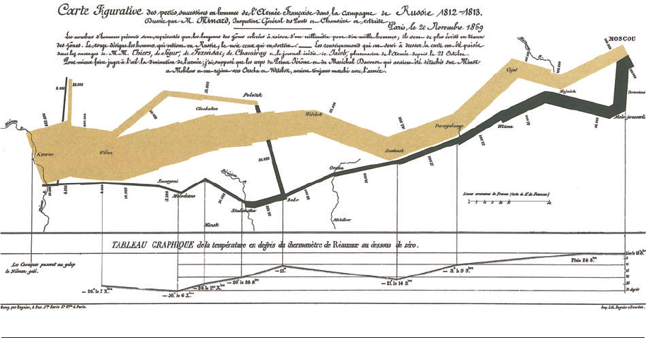
Tufte illustrates the point with Charles Joseph
Minard’s famous visualization of Napoleon’s
march on Moscow, reproduced in Figure 2.
He remarks that this image “may well be the
best statistical graphic ever drawn,” and argues
that it “tells a rich, coherent story with its mul-
tivariate data, far more enlightening than just
a single number bouncing along over time. Six
variables are plotted: the size of the army, its lo-
cation on a two-dimensional surface, direction
of the army’s movement, and temperature on
various dates during the retreat from Moscow”
(Tufte 1983, p. 40). It is worth noting how dif-
ferent Minard’s image is from most contem-
porary statistical graphics. Until recently, these
Figure 2
Minard’s visualization of Napoleon’s advance on and retreat from Moscow is a classic of visualization, but its design is in many ways
atypical.
www.annualreviews.org
•
Data Visualization in Sociology 109
Annu. Rev. Sociol. 2014.40:105-128. Downloaded from www.annualreviews.org
Access provided by Duke University on 08/09/17. For personal use only.
SO40CH05-MoodyHealy ARI 4 July 2014 13:29
have tended to be generalizations of the scatter-
plot or barplot, either in the direction of seeing
more data or seeing the output of models. The
former looks for ways to increase the volume of
data visible, the number of variables displayed
within a panel, or the number of panels dis-
played within a plot. The latter looks for ways
to see results of models—point estimates, con-
fidence ranges, predicted probabilities, and so
on. Tufte (1983, p. 177) acknowledges that a
tour de force such as Minard’s “can be described
and admired, but there are no compositional
principles on how to create that one wonderful
graphic in a million.” The best one can do for
“more routine, workaday designs” is to suggest
some guidelines such as “have a properly cho-
sen format and design,” “use words, numbers,
and drawing together,” “display an accessible
complexity of detail,” and “avoid content-free
decoration, including chartjunk” (p. 177).
Among this set of general goals are some
specific details that can be employed to good
use across applications. This includes extensive
use of layering and separation, for example,
building on the insights of good cartography.
Judicious use of stroke weight and color allows
one to layer multiple meanings on a single
visual plane. The ability to successfully pull
off such effects depends on use of the smallest
effective difference—lighter lines, smaller color
variations, and simpler textures. It has long
been a complaint of chart designers that accom-
plishing this often means working very much
against the (highly detailed, drop-shadowed,
rich, Corinthian leather) grain of t he default
settings in spreadsheet or other chart-making
applications. Comparison and evaluation are
often enhanced by the use of many small
multiples—plots that repeatedly display some
reference variable or relationship (e.g., gross
domestic product versus health care costs over
time) and iterate across some other variable of
interest (e.g., country) in an ordered fashion
(see also Bertin 1967 [2010], pp. 217–45). The
use of such multiples highlights the notion of
parallelism that allows a reader to carefully
compare across instances of similar-but-
crucially-different items. Combined, these fea-
tures facilitate a simultaneous micro and macro
reading where key points are clearly communi-
cated at the surface, but deeper meaning is ob-
tained through careful review and exploration.
A common complaint about Tufte’s work
is that there are so few direct instructions.
Busy cooks want a cookbook, not a picture
of a fantastic meal. The tendency for the
codification of data visualization to vacillate
between overly abstract maxims and overly
specific examples is characteristic of any craft
where a practical sense of how to proceed—a
taste or feeling for the right choice—matters
for successful execution. A long-standing and
plausible response to the problem is to have the
designer make many of the judicious choices in
advance and then embed them for users in the
default settings of graphics applications. Given
that graphical software aimed at regular users
has been around for several decades now, how-
ever, these efforts have proven less successful
than initially hoped. In the foreword to the
new edition of Semiology of Graphics, Howard
Wainer (2010, p. xi) reflects on the hope he
and others once felt that easy-to-use graphical
tools and software would lead to better general
practice by way of smarter defaults. But, he
argues, this has not happened. In the end, high-
quality graphical presentation requires crafting
a deliberately designed message rather than
accepting the pre-established setting. Recent
theoretical work explicitly recognizes the limits
of relying on defaults. Following Wilkinson in
implementing ggplot’s “grammar of graphics”
for R, Wickham (2010, p. 3) notes that the
analogy to grammar is useful because although
“[a] good grammar will allow us to gain insight
into the composition of complicated graphics,
and reveal unexpected connections between
seemingly different graphics[,] ...there will
still be many grammatically correct but non-
sensical graphics. ... [G]ood grammar is just
the first step in creating a good sentence.”
If software defaults cannot enforce the ele-
ments of good taste, the next best—or maybe
better—thing is a means to easily expose the
mechanics of good practice. One of the most
positive developments in statistical software
110 Healy
·
Moody
Annu. Rev. Sociol. 2014.40:105-128. Downloaded from www.annualreviews.org
Access provided by Duke University on 08/09/17. For personal use only.
SO40CH05-MoodyHealy ARI 4 July 2014 13:29
over the past 15 years has been its integration
with a much broader set of tools built to
facilitate the sharing of both data and code.
The first wave of modern statistical graphics
and information design could convey, in print,
the general principles and the quality products.
But the crucial piece in between—the design
process and practical assembly—remained
opaque. Subsequently, communities of users
began to share not just output but code much
more widely, whether under the auspices of
a for-profit developer (as in the case of Stata)
or actively backed by free or open-source
licensed platforms (as with R) or expert user
blogs (http://sas-and-r.blogspot.com, http://
flowingdata.com, http://www.r-statistics.
com/tag/visualization). Some of these have
developed into comprehensive references
aimed at the practicing researcher (Chang
2013). Most recently, pastebins and software
development platforms backed by distributed
version control systems—most notably
Github—have made sharing code both techni-
cally much easier and normatively expected.
As with the move toward replication data
sets, everyday sharing of code allows novices
to look behind the curtain much more easily
than before. And perhaps unlike the earlier
emphasis on accepting sensible defaults, it
encourages new users to tinker with various
methods and learn by doing. In many cases,
software now allows users to control very
detailed layout elements in their program
scripts, which (with a little extra language
work) allows one to override defaults with
principled graphical choices. This ongoing
integration of guidebooks, how-to websites,
code repositories, and fully reproducible
examples is a major step forward for improving
visualization practice. As one particularly well-
developed example among many, UCLA’s
Institute for Digital Research and Education
has a large library of worked graphical examples
implemented across several statistics packages
(http://www.ats.ucla.edu/stat/dae). Finally,
because most statistical packages can now pro-
duce graphics as editable vector graphics files,
one can use any graphical editor to fine-tune
elements (such as line thickness, greater
subtlety in color selection, etc.) for production.
These developments do not make questions
of judgment and good practice go away. Sta-
tistical visualization needs to be thought of as
part and parcel of analysis and presentation. We
should be crafting visualizations thoughtfully in
the same way we craft arguments or build mod-
els. Resources of this sort cannot by themselves
guarantee that code snippets will not simply be
mechanically copied or inappropriately applied
by users looking for a shortcut to a good out-
come. But, to paraphrase Keynes from a dif-
ferent context, they do seem to promise if not
civilized visualization, at least the possibility of
civilized visualization.
VISUALIZATION IN PRACTICE
We have argued that there are several promis-
ing ways that general principles of visualization
can become more tangible in everyday use. We
now turn to the question of current practice
in a little more detail. Here we follow the
common distinction between visualization
for exploration versus presentation of a final
finding. The former is meant for internal
consumption, as the researcher examines the
data to figure out what is going on; the latter
is designed to convince a wider audience. Nat-
urally, these processes overlap to some degree.
The general principles covered in the previous
section—regarding clarity, honesty, showing
the data, and so on—apply equally to both the
backstage and frontstage of visualization work.
But what is needed in each case does differ.
Some recent developments on each side are
worth highlighting.
Exploring the Data
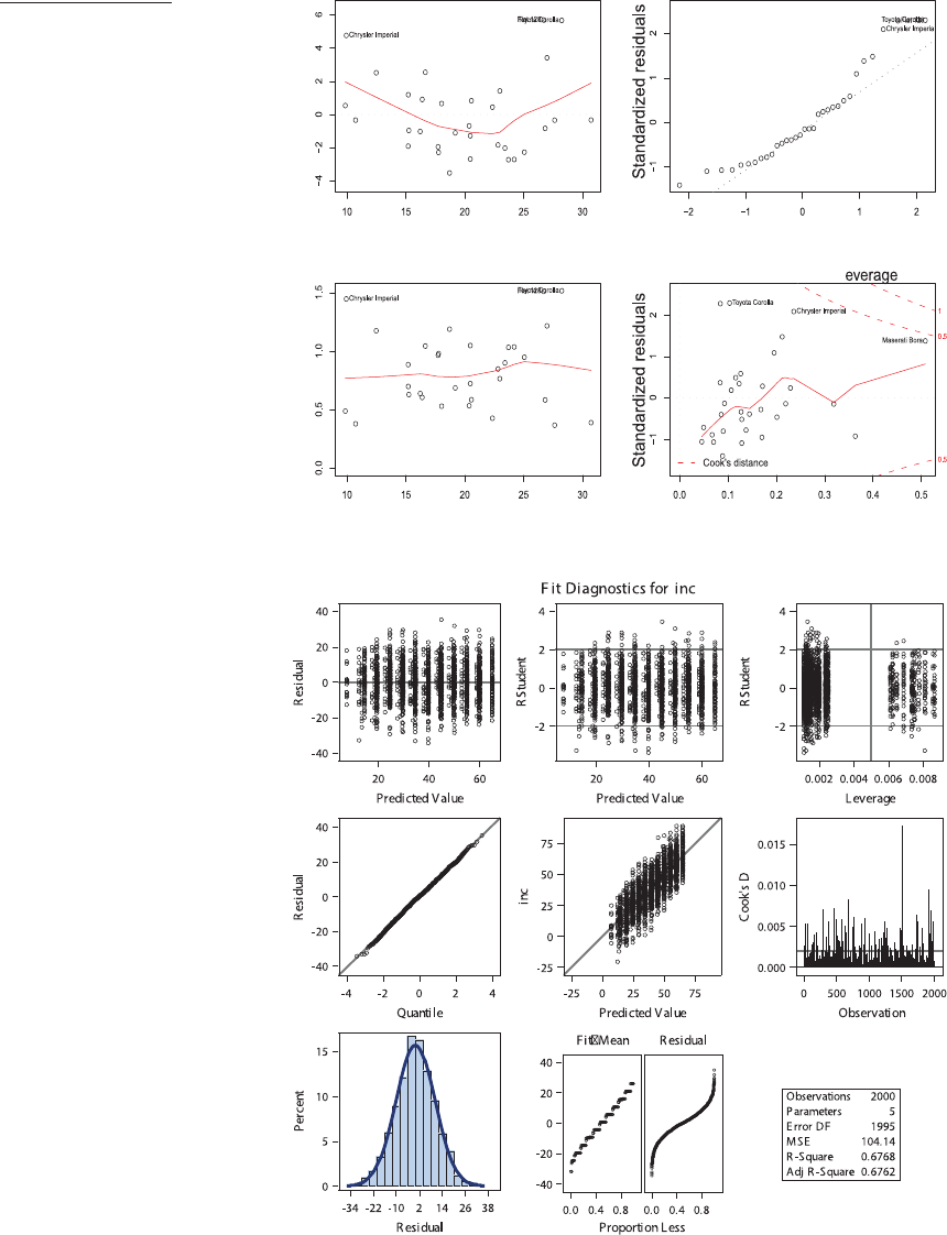
Graphical methods are now well integrated into
the process of checking assumptions and ro-
bustness in most statistical packages and are
often generated by default. Figure 3 shows a
typical example of some diagnostic plots of an
ordinary least squares regression. They were
produced on demand and by default, with no
www.annualreviews.org
•
Data Visualization in Sociology 111
Annu. Rev. Sociol. 2014.40:105-128. Downloaded from www.annualreviews.org
Access provided by Duke University on 08/09/17. For personal use only.
SO40CH05-MoodyHealy ARI 4 July 2014 13:29
a
Fitted values
Residuals
Residuals vs Fitted
Theoretical Quantiles
Normal Q−Q
Scale−Location
Leverage
Residuals vs L
Standardized Residuals
Fitted values
b
Figure 3
Default diagnostic
plots for a linear
model: (a)R,(b)SAS.
Though automatically
produced, both panels
present information
clearly and with
judicious use of
labeling and color.
112 Healy
·
Moody
Annu. Rev. Sociol. 2014.40:105-128. Downloaded from www.annualreviews.org
Access provided by Duke University on 08/09/17. For personal use only.
SO40CH05-MoodyHealy ARI 4 July 2014 13:29
further tweaking or polishing. Note that al-
though we voiced some skepticism above about
the ability of defaults to shape practice, these
plots are models of clarity. They could be
called into service for presentation purposes in
a pinch. Their real utility, however, is the ease
with which they can be produced and viewed
as part of one’s everyday workflow as a social
scientist: With tools like these, comments on
outliers such as Jackman’s (1980) should never
again be necessary.
Diagnostic plots of this kind are—in
principle—what you look at after a model has
been chosen. They are confirmatory rather than
strictly exploratory. Advocacy of exploratory
data analysis (EDA), of looking carefully and
creatively before modeling, is most closely as-
sociated with John Tukey (1972, 1977). His-
torically, EDA has been closely tied to the rise
of graphical capabilities in statistical comput-
ing, particularly tools that allow rapid interac-
tive visualization. A mild sense of unease with
EDA is a feature of the statistical literature. The
approach is explicitly inductive and concerned
with exploring data in a relatively freewheeling
fashion as an aid to discovery, which at times can
seem uncomfortably opportunistic or unstruc-
tured. To working social scientists these are of-
ten virtues, but statistics is also th e discipline
where the avoidance of spurious associations is
a major focus of technical work.
As data sets have continued to increase in
both size and dimensionality, and as computing
power and graphical methods have tried to
keep up, there has been a rapprochement
between the strictly exploratory and strictly
confirmatory approaches. Working social
scientists routinely explore their data as part
of the process of cleaning and checking it. It
would be naive to think researchers were not on
the lookout—literally—for interesting patterns
in complex data sets. Recent developments in
EDA have focused on extending established
methods of easily looking at a lot of data at
once, and on developing new ways for visually
checking the validity of apparent relationships.
The idea is to make the exploratory a little
more confirmatory.
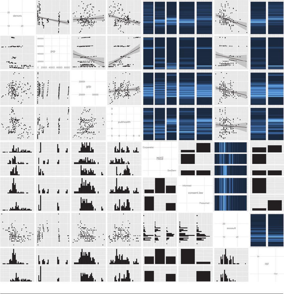
A first useful tool for this sort of exploration
is a generalized scatterplot matrix. I n a standard
pairs plot, the goal is to see all the bivariate rela-
tionships in the data at once, presented in a grid
so that quick comparisons can easily be made.
An unfortunate limitation, particularly for the
social sciences, is that these plots do a poor job
with categorical variables. Ideally we would like
to see the panels of the matrix display the data
in a form appropriate to the underlying vari-
able. A generalized pairs plot (Emerson et al.
2013) accomplishes this, using barcode plots,
boxplots, mosaic plots, and other methods.
Figure 4 shows an example. The specific soft-
ware implementation adds additional function-
ality, including the ability to display different
plots—such as barcode and mosaic plots—in
the upper and lower triangles of the plot ma-
trix, histograms along the main diagonal, and
the option of adding smoothed or linear regres-
sion lines to panels.
Generalized pairs plots can be extended even
further, depending on the software, by allow-
ing further partitioning within panels. For in-
stance, we can show separate histograms of a
continuous variable broken out by the values
of a categorical variable. Multipanel plots are
intrinsically rich in information. When com-
bined with several within-panel types of repre-
sentation and a large number of variables, they
can become quite complex. But, again, the main
utility of this approach is less in the presenta-
tion of finished work—although it can certainly
be useful for that—and more in the way it en-
ables the working researcher to quickly inves-
tigate aspects of her own data. The goal is not
to pithily summarize a single point one already
knows, but to open things up for further ex-
ploration. Harrell (2001) remains an exemplary
book-length demonstration of the virtues of in-
tegrating graphical methods with the process
of data exploration (including exploring pat-
terns of missingness in the data) right across
the process of model building, diagnostics, and
presentation.
With many variables and large amounts
of data, a square matrix of plots can become
unwieldy even to the trained eye. Seeing more
www.annualreviews.org
•
Data Visualization in Sociology 113
Annu. Rev. Sociol. 2014.40:105-128. Downloaded from www.annualreviews.org
Access provided by Duke University on 08/09/17. For personal use only.
SO40CH05-MoodyHealy ARI 4 July 2014 13:29
Figure 4
Ageneralizedpairsplothandlescategoricaldataeasily,andindifferentways.
data more quickly, and in particular exploring
high-dimensional data in a controlled way,
has been a focus of recent visualization re-
search. Early work—going back to Tukey, and
others—allowed for the exploration of data
in three dimensions, for instance by way of
rotating a cloud of points on a screen. This
sort of approach “demoed well,” as spinning
around a cloud of colored points looks quite
impressive to the casual observer. But in-
terpreting these displays is another matter.
Thus, methods for interactively exploring
114 Healy
·
Moody
Annu. Rev. Sociol. 2014.40:105-128. Downloaded from www.annualreviews.org
Access provided by Duke University on 08/09/17. For personal use only.
SO40CH05-MoodyHealy ARI 4 July 2014 13:29
−1 −0.8 −0.6 −0.4 −0.2 0
Correlation
0.2 0.4 0.6 0.8 1
cerebvas
pubhealth
pubtopriv
proglib.trim
assault
donors
roads
external
gdp
health
pop
pop.dens
tradcon.trim
cerebvas
pubhealth
pubtopriv
proglib.trim
assault
donors
roads
external
gdp
health
pop
pop.dens
tradcon.trim
−0.04
0.59
0.45
−0.13
0.12
−0.27
0.07
−0.08
−0.12
0.25
0.28
−0.01
−0.01
0.01
0.11
0.48
−0.04
−0.27
−0.01
−0.37
0.27
0.02
0
0.83
0.44
0.15
−0.2
−0.09
−0.41
−0.35
−0.19
−0.33
−0.28
0.39
0.14
−0.01
0.07
−0.44
−0.26
−0.42
−0.3
−0.19
0.27
0.06
−0.03
−0.06
−0.04
−0.33
−0.76
−0.64
0.35
0.14
0.33
−0.34
0.14
−0.11
−0.16
0.51
0.47
0.03
−0.23
−0.02
0.06
0.58
0.38
−0.21
0.04
−0.07
0.26
0.26
0.04
−0.16
0.11
−0.03
−0.12
0.33
0.07 0.85
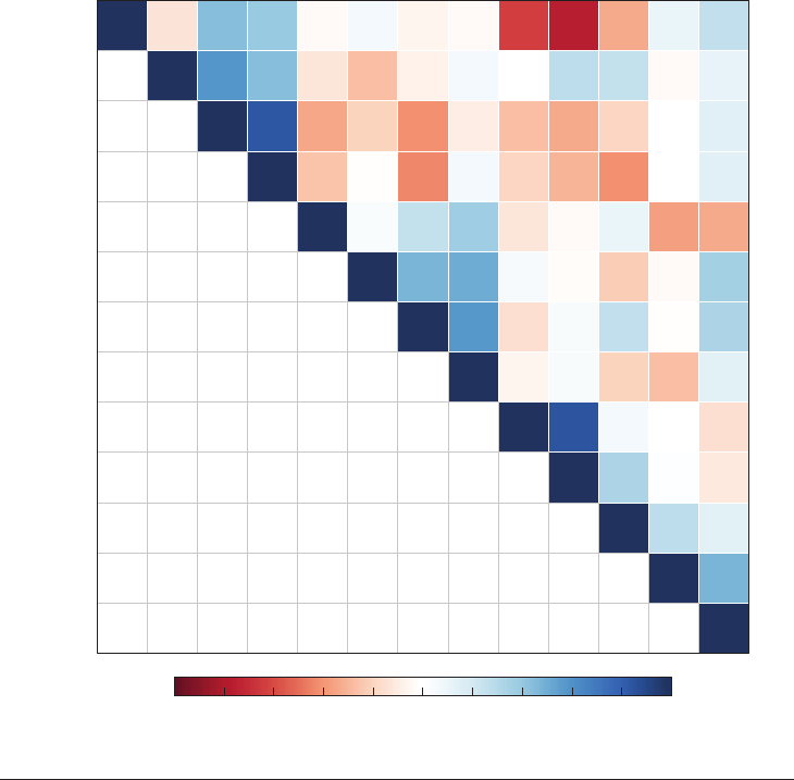
Figure 5
Acorrelationmatrixrepresentedasatiledheatmap(upper triangle) with color-keyed correlation coefficients
(lower triangle).
data sets advanced on two fronts. The first
moved toward further development of mul-
tiple panels, notably with innovative ways of
visually conditioning on additional variables
or highlighting interactively selected cases
across panels. Co-plots, shingles, and contour
or surface plots are all examples of this kind
of development (Cleveland 1993, pp. 186–271;
Sarkar 2008, pp. 67–115). Increasingly, these
methods take advantage of color for presenting
data, as with heatmaps or tiled representa-
tions of a correlation matrix (see Figure 5).
Tools for permuting correlation matrices,
either in the order produced by factor-analytic
techniques or other direct optimization, allow
one to identify higher-order patterns in such
figures (Breiger & Melamed 2014).
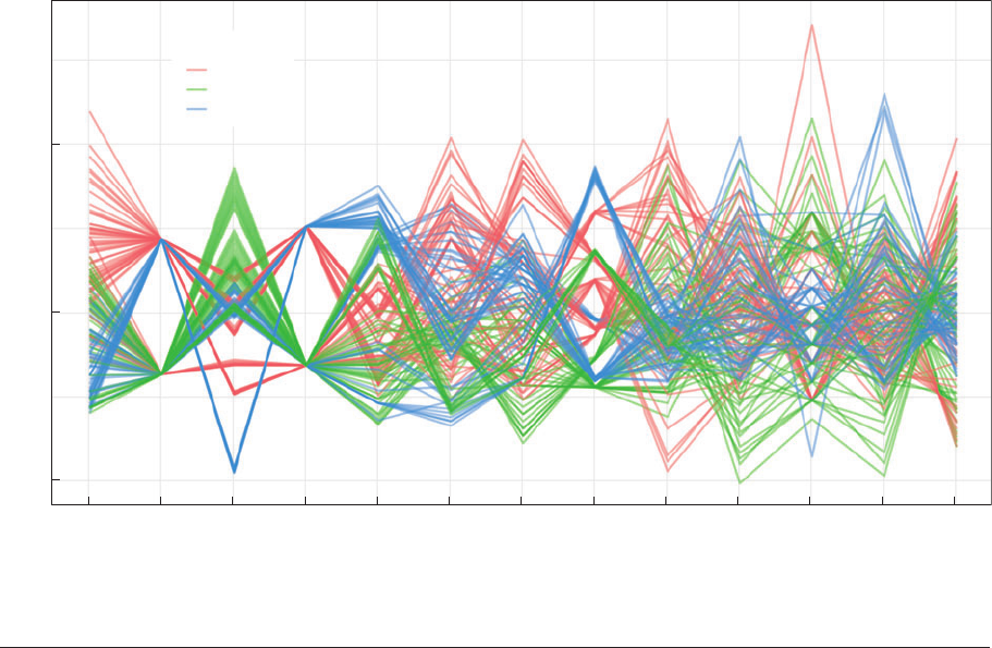
A second direction has been the develop-
ment of parallel coordinate plots, which show
multiple variables side by side in a way that
allows for the visualization of both specific
outliers and clusters of association across
many variables at once (Moustafa & Wegman
2006, Inselberg 2009). Figure 6 gives a simple
www.annualreviews.org
•
Data Visualization in Sociology 115
Annu. Rev. Sociol. 2014.40:105-128. Downloaded from www.annualreviews.org
Access provided by Duke University on 08/09/17. For personal use only.
SO40CH05-MoodyHealy ARI 4 July 2014 13:29
−2.5
0.0
2.5
roads
consent.law
txp.pop
opt
pubtopiv
external
pubhealth variable
pop.dens
donors
health
assault
gdp
cerebvas
Value
Corporatist
Liberal
SocDem
World
Figure 6
A parallel coordinates plot highlighting a possibly relevant grouping variable.
example, although the approach is best suited
to much larger numbers of variables and obser-
vations than shown here. This sort of plot also
benefits from being used interactively, as the
ordering of the variables (and the highlighting
of possible grouping variables) can change
the interpretability of the graph quickly. The
GGobi system, for example, is designed to
provide interactive, semiautomated facilities
for “touring” large, high-dimensional data in
real time using parallel plots and a variety of
other methods (Cook & Swaine 2007).
This broad EDA tradition has recently be-
gun to reconnect with the model-checking
or diagnostic approach, with convergence
happening from both directions. The long-
standing concern here is that a striking visual-
ization might not correspond to any robust un-
derlying phenomenon. Early advocates of data
visualization typically presented a “parade of
horribles” (e.g., Wainer 1984) showing how bad
visual presentation can distort or misrepresent
the data. But even properly presented visual-
izations can be vulnerable to spurious pattern
attribution on the part of researchers and ob-
servers. From the EDA side, Wickham et al.
(2010) and Buja et al. (2009) provide some prin-
cipled ways for assessing, in a broadly graphi-
cal manner, whether or not the patterns one is
seeing are likely to be spurious. For example,
a permutation lineup presents observed data
in a small-multiple context surrounded by null
plots of generated data. “Which plot shows the
real data?” Buja et al. (2009, p. 4372) ask. If
observers cannot reliably pick it out, then we
should doubt both the utility of the plot and
the soundness of any inferences (or arguments)
based on it. From the modeling side, Gelman
(2004, pp. 773–74) argues that a Bayesian ap-
proach provides a principled framework for as-
sessing “the implicit model checking involved
in virtually any data display.”
116 Healy
·
Moody
Annu. Rev. Sociol. 2014.40:105-128. Downloaded from www.annualreviews.org
Access provided by Duke University on 08/09/17. For personal use only.

SO40CH05-MoodyHealy ARI 4 July 2014 13:29
Although we have argued that sociologists
have been relatively slow to adopt data visual-
ization, several of the issues we have discussed
have independently appeared within the socio-
logical literature. Sociologists routinely deal
with data where almost all the variables of inter-
est are categorical, for example. And, as noted
above, the routine and effective display of cate-
gorical data (especially cross-classified categor-
ical data) has not been a trivial problem to solve.
Furthermore, sociology has a long tradition of
using methods that reduce high-dimensional
data in some way—especially via factor analysis,
principal components, correspondence analy-
sis, or other related methods. In Distinction, for
example, Bourdieu (1984, pp. 128–29, 262, 266,
343) presents his analysis of the space of French
social class and taste in a way that is both highly
visual but also—for some critics—decidedly dif-
ficult to interpret. This family of methods lends
itself to suggestive visualization in what might
be called a configurational mode. This is some-
what inimical to the Anglo-American tradition
of seeking causal relations in statistical models.
Breiger (2000) provides a useful discussion of
some of the issues here, emphasizing points of
convergence.
Dimensional reduction of this sort typically
characterizes the problem of interest in terms
of space or distance, which naturally encourages
the mapping of social systems. Sociologists have
been among t he earliest users of these visualiza-
tion tools, particularly with network analysis.
The earliest interactive network tools were lit-
erally peg boards and rubber bands (Freeman
2004) or pins-and-strings.
1
Interactive explo-
ration of social network data has obviously been
made much easier with the advent of efficient
computer programs. Released in 1996, PAJEK
was one of the earliest completely interactive
visualization tools that was also optimized for
large networks. Earlier software typically sepa-
rated the visualization and analysis steps. There
has since been rapid growth in the development
1
See http://www.soc.duke.edu/∼jmoody77/VizARS/sna_
peg.jpg.
of interactive network exploration tools, in-
cluding on the web (http://www.theyrule.net,
http://dirtyenergymoney.com). The chal-
lenge for such work is excess reduction in the
inherent complexity of the data, which has led
methodologists to propose fit statistics for net-
work layouts (Moody et al. 2005, Brandes et al.
2012).
The rapid availability of fully dynamic net-
work data has created opportunities and chal-
lenges for visualization. Network movies, for
example, allow one to capture the relational dy-
namics as they unfold in space and time (Moody
et al. 2005, Bender-deMoll et al. 2008, Morris
et al. 2009). The clear advantage of a net-
work movie is that one can reserve the two
dimensions of the visual plane for mapping
the topography of the social system and watch
the shape of the system change as the anima-
tion runs. This is particularly useful for explo-
ration, as it makes visible dynamic features that
are otherwise difficult to capture in summary
statistics. But there are also costs. People tend
to have poor visual memories, so comparing
nonadjacent moments in time is challenging,
and the analyst must make strong assumptions
about how to aggregate the network events
over time. Similar visualization challenges are
becoming common in dynamic statistical dis-
plays, such as the GapMinder data set, which
allows one to explore associations over time
(http://www.gapminder.org).
Presenting the Results
These considerations lead naturally to the ques-
tion of presenting data. Most of t he principles
discussed above regarding the construction of
figures for exploring data also apply to present-
ing it, if only because the audiences are often
the same—that is, experts in a particular field.
But effective statistical graphics have a rhetor-
ical aspect, too (Kostelnick 2008). In general,
the goal is to look for ways of presenting the
data that are both effective with respect to one’s
argument and honest with respect to the data.
Though conceptually simple and among the
earliest examples of statistical visualizations,
www.annualreviews.org
•
Data Visualization in Sociology 117
Annu. Rev. Sociol. 2014.40:105-128. Downloaded from www.annualreviews.org
Access provided by Duke University on 08/09/17. For personal use only.
SO40CH05-MoodyHealy ARI 4 July 2014 13:29
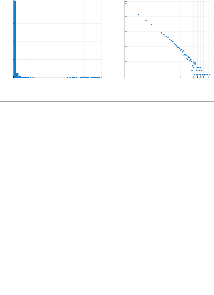
0 20 40 60 80 100
0
20
40
60
80
Authors (%)
Total number of lifetime publications Total number of lifetime publications
Authors (%)
1
10 100
0.001
0.01
0.1
1
10
100
ab
Figure 7
The distribution of authors’ lifetime number of publications in three very selective sociology journals is
highly skewed. In comparison to a standard histogram (a), a log-log histogram (b) is much better at revealing
details in the “long tail” of the distribution.
variable distributions remain of keen substan-
tive interest. Many of the distributions typically
studied in sociology are extremely skewed and
difficult to display as simple histograms. Con-
sider, for example, some data on the number of
times authors publish in a select set of journals
(here the American Sociological Review, Ameri-
can Journal of Sociology,andSocial Forces) over
the course of their career. Figure 7a presents
a standard histogram, whereas Figure 7b fol-
lows the convention now common in the phys-
ical sciences of presenting the distribution on a
log-log scale.
When comparing distributions across cat-
egorical variables, comparative boxplots allow
one to examine multiple moments of a distri-
bution across multiple categories or over time
(with some loss of resolution). The presentation
of joint distributions of multiple categorical
variables has similarly been improved with
area-accurate Venn diagrams (see for example,
http://www.eulerdiagrams.org/eulerAPE).
An important contribution to this literature
is the work of Handcock & Morris (1999) on
relative distribution methods. By comparing
the ratio of two distributions at each point
along the x-axis, one is quickly able to identify
differences in both shape and central tendency.
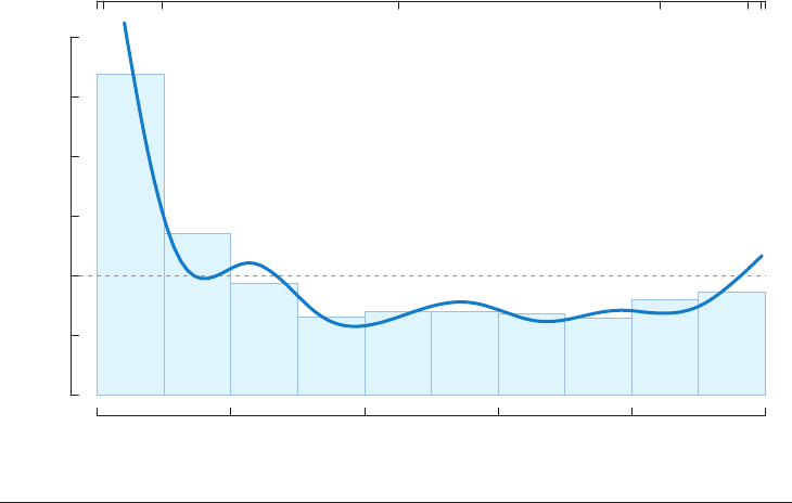
Figure 8 reproduces the relative distribution
in permanent wage growth for two cohorts of
the N ational Longitudinal Survey. If the wage
distributions were identical, the density would
be a simple horizontal line at 1.0; instead we
see much greater inequality (heavier tails at
both ends) in the recent cohort.
A related problem involves effectively
displaying trends over time, particularly when
attempting to demonstrate strong variability
across units. The convention of reserving the
x-axis for time and the y-axis for magnitude
becomes tricky if many series are given equal
weight. An effective solution involves carefully
choosing colors, line weights, and labels to
highlight a particular strand among many (see
Figure 10 below). Moody et al. (2011) are
able to demonstrate the wild variability in
adolescent popularity sequences by generating
a scatterplot of trajectory summaries with
exemplar labels.
2
Because each position in the
2
See http://www.soc.duke.edu/∼jmoody77/VizARS/
Figure5.jpg for trendspace; http://www.soc.duke.edu/
∼jmoody77/VizARS/Figure%206.pdf for application of
this space to model prediction outcomes.
118 Healy
·
Moody
Annu. Rev. Sociol. 2014.40:105-128. Downloaded from www.annualreviews.org
Access provided by Duke University on 08/09/17. For personal use only.
SO40CH05-MoodyHealy ARI 4 July 2014 13:29
Proportion of the original cohort
Permanent dierences in log wages
Relative density
0.0
0.5
1.0
1.5
2.0
2.5
3.0
0.0 0.2 0.4 0.6 0.8 1.0
−1 0.5 1 1.5 2
Figure 8
The relative probability density function distribution of permanent wage growth in the original and recent
National Longitudinal Survey cohorts. A decile bar chart is superimposed on the density estimate. The
upper axis is labeled in permanent differences in log wages (adapted from Handcock & Morris 1999).
field captures a unique trend, the distributional
coverage of the space suggests there is no
typical sequence.
Moving beyond simple variable compari-
son displays, the bulk of statistical work in so-
ciology involves complex multivariate models.
Even with good statistical training, tables of
coefficients are hard to decipher quickly and
tend to foreground statistical significance over
substantive magnitudes. Straightforwardly in-
terpreting the effects of independent variables is
rarely intuitive, especially for models with com-
plex link functions, categorical components,
or interaction terms. Although odds ratios are
margin free and thus nominally interpretable,
knowing whether an effect is substantively large
is often difficult without comparative context
and may be impossible to discern directly from
the table without intimate knowledge of the un-
derlying distribution of control variables. The
simplest solution to this problem is to use the
model to predict outcome variables at differ-
ent levels or combinations of the independent
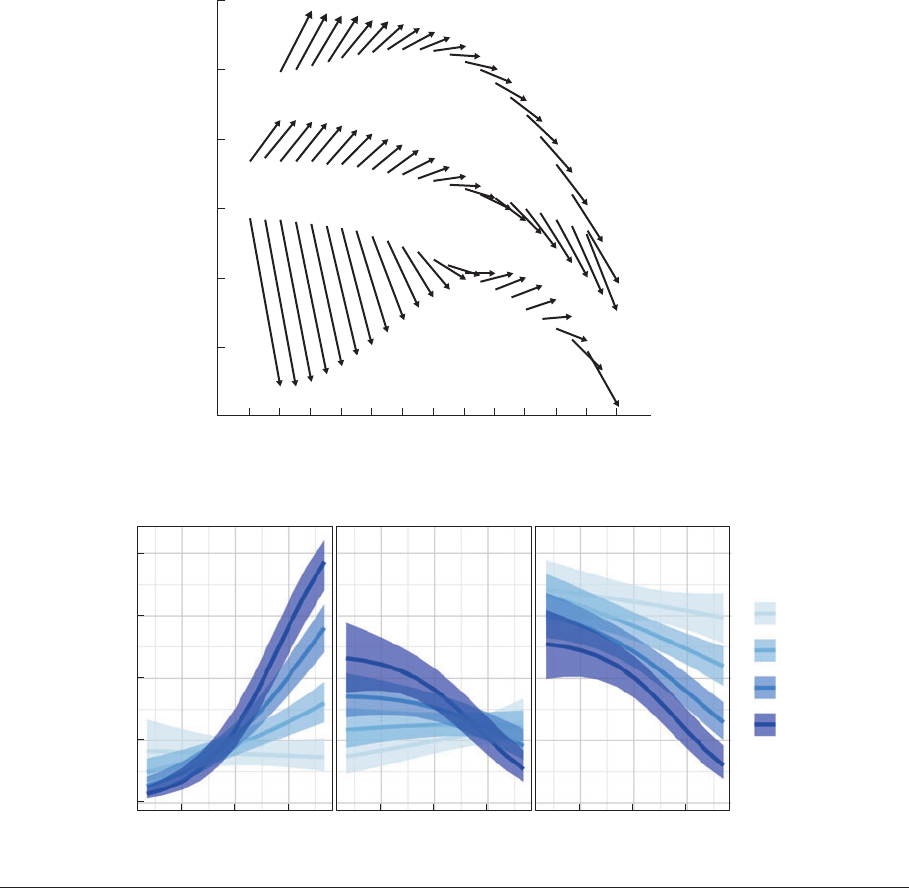
variables of interest. Figure 9a shows a pow-
erful example from Mirowsky & Ross (2007).
They use a new style of vector graphs for la-
tent growth models by age (see Mirowsky &
Kim 2007) to display predicted values from in-
teraction terms. This enables them to take re-
sults from a complex structural equation model
of people’s perceived sense of control and si-
multaneously illustrate both within-cohort and
between-cohort changes at varying levels of ed-
ucation in a way that would be otherwise very
difficult to represent.
The figure allows one to identify changes
within cohorts (change within vector) and over
time (sequence of arrows by group). Here we
see that high s chool dropouts have a lower
sense of control overall but a dramatic drop in
sense of control during youth that levels out
as they age. College-educated respondents, in
contrast, have a generally high sense of control
that is continuously optimistic through adult-
hood, turning negative only after about age 60.
Recent advances in the use of statistical graphics
www.annualreviews.org
•
Data Visualization in Sociology 119
Annu. Rev. Sociol. 2014.40:105-128. Downloaded from www.annualreviews.org
Access provided by Duke University on 08/09/17. For personal use only.
SO40CH05-MoodyHealy ARI 4 July 2014 13:29
1.2
1.0
0.8
0.4
0.2
0.0
0.6
Predicted sense of control
18 24 30 36 42 48 54 60 66 72 78 84 90
Age (years)
College
degree
High school
degree
No high school
degree
83
Y Percentile
68
51
18
9
33
a
LabourLiberal DemocratConservative
0.0
0.2
0.4
0.6
0.8
369 369 369
Attitude toward Europe
Probability
Knowledge
0
1
2
3
b
Figure 9
(a) Vector diagram for latent trajectory model of perceived control by age, cohort, and education (adapted from Mirowsky & Ross
2007, with permission from the University of Chicago Press). (b) Predicted probabilities and standard errors plotted from a multinomial
model (adapted from Fox & Hong 2009).
for model interpretation include estimates of
the uncertainty of the mod el predictions. Most
software now provides easy access to model
predictions from the data, and this allows one
to provide results under varying scenarios (see,
for example, Alkema et al. 2011). In this case,
the hard work is done before the plot is made.
Figure 9b shows a series of predicted proba-
bilities from a multinomial model at different
levels of various predictors and outcomes,
with appropriate standard errors shown. Here
no conceptual advances are needed on the
120 Healy
·
Moody
Annu. Rev. Sociol. 2014.40:105-128. Downloaded from www.annualreviews.org
Access provided by Duke University on 08/09/17. For personal use only.
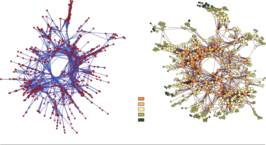
SO40CH05-MoodyHealy ARI 4 July 2014 13:29
Colorado Springs
HIV risk network
a Default PAJEK view b Edited for presentation
High
Low
Closeness
centrality
Figure 10
Network exemplar of moving between software default and presentation results. Subtle adjustments to line widths and color palettes
and the addition of a centrality scale greatly aid interpretability in (b).
graphical side, just the ability to get informa-
tion out of the model in a readily interpretable
form (Fox 2003, Fox & Hong 2009).
The distance between exploratory and pre-
sentation graphics is most pronounced as the
density of information necessary to display in-
creases. Network images are particularly inter-
esting in this case. A little effort with layering
and coloring makes a real difference. Consider
also Figure 10, which shows a before and after
of the same data. The basic layout is retained
(with the addition of a little jittering to allevi-
ate algorithmically induced stacking), but the
result is much more interpretable.
Recent work on constructing visually inter-
pretable social networks has focused on care-
ful data reduction, either by suppressing nodes
entirely in favor of contour-style diagrams
(Moody 2004, Moody & Light 2006) or by
deleting or bundling edges to highlight struc-
ture (Crnovrsanin et al. 2014). Other work
has focused explicitly on quantifying the layout
model using stress or multidimensional scaling–
related techniques (Frank & Yasumoto 1998,
Brandes & Pich 2006, Brandes et al. 2012; see
Lima 2011 for exemplars).
Our focus so far has been on presenting re-
sults to professional peers. But in recent years
the clear presentation of data to broader publics
has become increasingly important. It has never
been easier to circulate full-color graphics of
original data analysis to large groups of peo-
ple. Social sharing of data through the Inter-
net generally, but especially through services
such as Facebook and Twitter, has accelerated
the rise of infographics or info-visualization.
To many working statisticians, infographics
are the descendants of Tufte’s Ducks—those
“self-promoting graphics” where “the over-
all design purveys Graphical Style rather than
quantitative information” (Tufte 1983, p. 116).
The contemporary infographic in its pure
form is a supercharged megaduck incorporat-
ing not only the bells and whistles derided by
www.annualreviews.org
•
Data Visualization in Sociology 121
Annu. Rev. Sociol. 2014.40:105-128. Downloaded from www.annualreviews.org
Access provided by Duke University on 08/09/17. For personal use only.
SO40CH05-MoodyHealy ARI 4 July 2014 13:29
Tufte but far more besides, such as a spurious
quasi-narrative structure, pictographic se-
quencing, or excessive dynamic elements.
Gelman & Unwin (2013) discuss Infovis-style
work from a statistical point of view. They argue
that most infographics do not meet the stan-
dards normally demanded of statistical visual-
izations, but they concede that sometimes the
goals of the latter are not those of the former.
It seems clear, though, that information
visualization tools will become ever more
widespread. In keeping with our general argu-
ment that good visualization is a component of
broader good practice around data analysis, a
key issue is the openness of standards and tools
for data analysis on the web. Social scientists
have typically worked within dedicated statisti-
cal applications to produce static graphics in a
format geared primarily for print publication.
But there has been tremendous development
over the past decade, and even just within the
past five years, in tools designed to present data
interactively on the web. The development of
powerful libraries written in JavaScript has al-
lowed developers to present statistical graphics
in a way that is quite open with respect to both
code and data. Mike Bostock’s D3 library, for
instance, is increasingly used by statisticians and
media analysts alike and provides a powerful set
of dynamic visual methods (Murray 2013). It is
always difficult to know ex ante which particu-
lar software tool kits have staying power in the
long run—functionally similar platforms and
libraries have come and gone before—which
is why static formats such as Postscript and
portable document format, or PDF, are so long-
lived. But even so, the leading edge of develop-
ment in this area seems to be moving to fur-
ther integrate specific statistical tools such as
R with data formats (notably JavaScript Object
Notation, or JSON) that can be presented effec-
tively and interactively in the browser. For some
kinds of data, notably the generation of dynamic
choropleth maps and cartograms, the standard
of presentation in some media outlets is now
very high. It can be difficult to interpret com-
plex and colorful maps with data chunked into
units that vary radically by size (e.g., US coun-
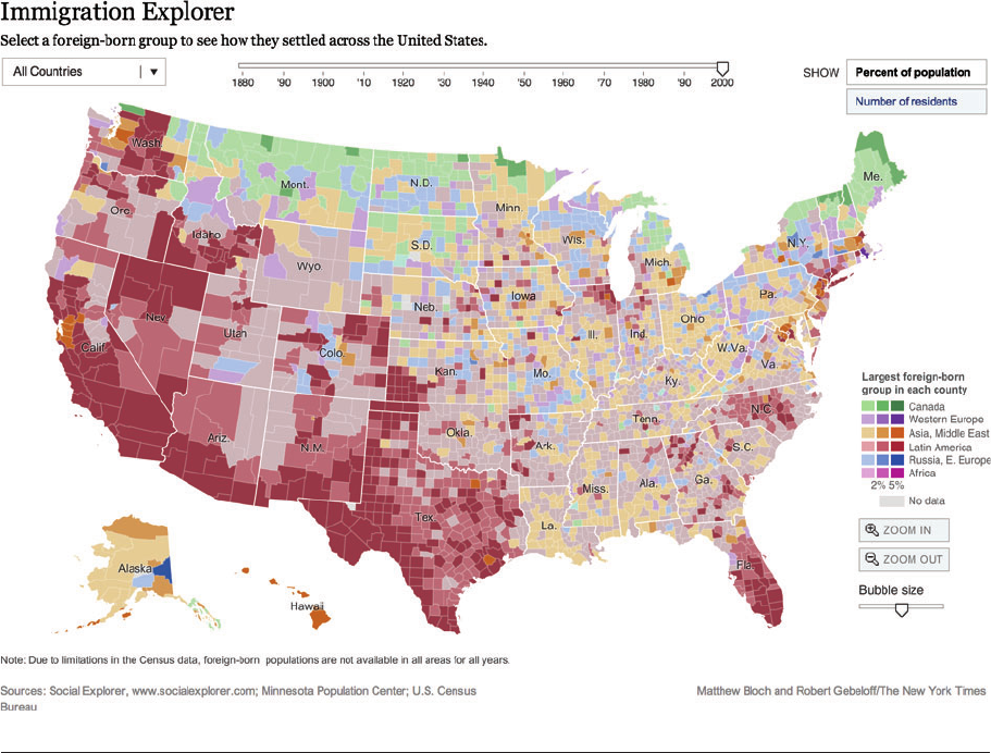
ties). Nevertheless, a map such as the one shown
in Figure 11,whichappearedintheNew York
Times (Bloch & Gebeloff 2009), makes for a very
engaging way to explore patterns both spatially
and over time. Presenting data of this sort in
an effective, interactive package is difficult for
small teams of researchers to accomplish. But
it is not impossible. Katz’s (2013) dialect survey
maps are a compelling recent example of what is
now within reach. Developers seem interested
in building the production of web-enabled con-
tent into the software sociologists are used to
using, and thus these tools are likely to continue
to become more powerful and easier to use.
For sociologists thinking about the public
impact of their work, it is worth bearing in
mind that, the sins of Infovis notwithstanding,
a well-crafted statistical graphic is the fastest
way to propagate one’s findings. Moreover, it is
easy to forget how revelatory the general public
can find even a relatively ordinary descriptive
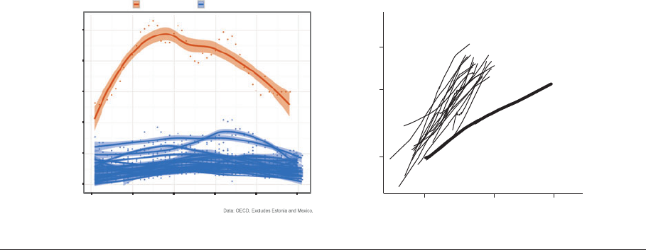
image if it is properly constructed. The panels
in Figure 12 show two examples. Figure 12a
shows the rate of deaths due to assault in 24
OECD countries between 1960 and 2011.
The point of the image is to emphasize the
exceptionally high death rate in the United
States compared with other countries (as
well as the large changes in the US number
that are visible over the timeframe), and so
the US series is colored separately from the
rest, with every other country getting their
own smoothed line and data points, but not
individual colors. The unique trajectory of the
United States is immediately apparent. The use
of color probably helped the image circulate
more widely in social media and traditional
outlets than it otherwise might have. Color is
not strictly necessary, however, as the superb
image in Figure 12b makes clear. Taken from
Kenworthy (2014), Figure 12b shows trends
in life expectancy plotted against a measure
of health expenditures for 20 countries. The
United States is singled out with a bolder line
than the others. Individu al data points are not
plotted. There are only seven numbers labeled
on the graph (including the one in “19 other
rich countries”), yet a strong argument based
122 Healy
·
Moody
Annu. Rev. Sociol. 2014.40:105-128. Downloaded from www.annualreviews.org
Access provided by Duke University on 08/09/17. For personal use only.
SO40CH05-MoodyHealy ARI 4 July 2014 13:29
Figure 11
A New York Times interactive choropleth map allows users to explore historical and geographical patterns of migration to the United
States (Bloch & Gebeloff 2009, adapted with permission from the New York Times;theinteractivemapisavailableathttp://www.
nytimes.com/interactive/2009/03/10/us/20090310-immigration-explorer.html).
on rich data is beautifully made about what has
happened to the returns to health spending in
the OECD generally, and in the United States
in particular. In the original presentation,
Kenworthy characterizes the data and mea-
sures with a compact note in the caption,
specifying the methods and measures. There is
nothing about this figure that is conceptually or
technically new. And yet a clearly conceived and
cleanly executed image like this is still relatively
uncommon in the sociological literature.
Visualizations of categorical data remain
more difficult to convey effectively, partly be-
cause the general public is not always familiar
with conventional ways to present it. Mosaic
plots, for instance, can be effective representa-
tions of contingency tables, but people are not
taught to read them in the same way they can
read bar charts or scatterplots. The effective
visualization of network data presents similar
issues. The dual problems of dimen sionality
and scale require creative ways to layer and
aggregate information in a manner that high-
lights the key features of interest. In an attempt
to characterize trends in political polarization
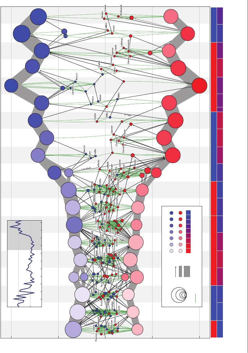
in the US Senate, Moody & Mucha (2013)
relied on a combination of multiple aggrega-
tion strategies and visual “identity arcs” linking
individuals over time that effectively pushed
“party loyalists” to the background while
www.annualreviews.org
•
Data Visualization in Sociology 123
Annu. Rev. Sociol. 2014.40:105-128. Downloaded from www.annualreviews.org
Access provided by Duke University on 08/09/17. For personal use only.
SO40CH05-MoodyHealy ARI 4 July 2014 13:29
0
2
4
6
8
10
1960 1970 1980 1990 2000 2010
Year
Assault Deaths per 100,000 population
United States 23 other OECD Countries
US
19 other rich
countries
70
78
83
Life expectancy
5 12 18%
Health expenditures
a Assault deaths by country b Life expectancy by country
Figure 12
(a) Assault deaths in the United States and 23 other OECD countries (Healy 2012). (b) Health expenditure (as a percentage of GDP)
and life expectancy in the United States and 19 other rich countries (see Kenworthy 2014; image courtesy of L. Kenworthy).
highlighting those (increasingly rare) senators
who reach across the aisle (Figure 13).
CONCLUSION
We have argued that quantitative visualization
is a core feature of social-scientific practice from
start to finish. All aspects of th e research pro-
cess from the initial exploration of data to the
effective presentation of a polished argument
can benefit from good graphical habits. Good
graphics are not, of course, the only thing—see
Godfrey (2013) for a discussion of the situation
of blind and visually impaired users of current
statistical software. But the dominant trend is
toward a world where the visualization of data
and results is a routine part of what it means to
do social science.
Getting general audiences comfortable with
different kinds of data visualization is a long-
term project, and not one that any particular
researcher or journal editor has any meaningful
control over. But given that the interpretability
of statistical graphics rests on both their inter-
nal coherence as objects and the shared rep-
resentational conventions they embody, a first
step is to insist on good standards in the peer
review process. A glance at recent issues of,
say, the American Sociological Review shows that
the standards for publishable graphical material
vary wildly between and even within articles—
far more than the standards for data analysis,
prose, and argument. Variation is to be ex-
pected, but the absence of consistency in ele-
ments as simple as axis labeling, gridlines, or
legends is striking. Just as training in elemen-
tary visualization methods should be a standard
component of graduate education, our flag-
ship journals should encourage their authors to
think about the most effective ways to encour-
age visual clarity. This should not take the form
of overly strict style guides but instead aim for
an ideal of consistent, considered good judg-
ment in the presentation of data and results in
the service of sociological argument.
Effective data visualization is part of a
broader shift in the social sciences where data
are more easily available, code and coding tools
are more widely accessible, and high-quality
graphical work is easy to produce and share.
We hope for professional audiences who ex-
pect to see effective graphics as a routine as-
pect of presented work, and we look forward
to wider publics who are able to comfortably
read and interpret good graphical work. Sociol-
ogists should take advantage of the remarkable
124 Healy
·
Moody
Annu. Rev. Sociol. 2014.40:105-128. Downloaded from www.annualreviews.org
Access provided by Duke University on 08/09/17. For personal use only.
SO40CH05-MoodyHealy ARI 4 July 2014 13:29
Polarization modularity
0
0.27
0.27
0.13
0.13
‘07–’08‘03–’04‘99–’00‘95–’96‘91–’92‘87–’88‘83–’84‘79–’80‘75–76
Democrats
US Senate voting similarity networks, 1975–2012
Timeline: president, Senate party balance, and date (through June 7, 2012)
Republicans
CarterFord Reagan G.H.W. Bush Clinton G.W. Bush
DRRDRRRDDDDRRRDDD
0
0.1
0.2
0.3
1910 1930 1950 1970
Year
1990 2010
Detail
Modularity
R
Obama
‘11–’12
DD
Group size Senators
crossing time
20
10
1
5062 6256 56
Senate balance
Within-group vote similarity
0.72
0.89
0.78
0.83
Vote similarity (≥0.6)
R
D
50
50
5
5
10
10
25
25
Figure 13
Aggregation and a known dimension (a polarization scale) simplify a complex network layout. (Adapted from Moody & Mucha 2013 with permission from Cambridge
University Press.)
www.annualreviews.org
•
Data Visualization in Sociology 125
Annu. Rev. Sociol. 2014.40:105-128. Downloaded from www.annualreviews.org
Access provided by Duke University on 08/09/17. For personal use only.
SO40CH05-MoodyHealy ARI 4 July 2014 13:29
progress in methods, tools, and means to
share—from statistics to computational social
science to web development—the better to see
the social world, and help others see it, too.
DISCLOSURE STATEMENT
The authors are not aware of any affiliations, memberships, funding, or financial holdings that
might be perceived as affecting the objectivity of this review.
ACKNOWLEDGMENTS
We thank Jaemin Lee, Achim Edelmann, and Richard Benton for comments on earlier drafts.
Permission to use copyrighted material was granted by the American Sociological Association
(Figure 1b), the University of Chicago Press (Figure 9a), the New York Times (Figure 11), and
Cambridge University Press (Figure 13). All other figures are taken from the public domain and/or
significantly redrawn and adapted by the authors. Partial support for this work was provided by
NIH grants 1R21HD068317-01 and 1 R01 HD075712-01.
LITERATURE CITED
Alkema L, Raftery AE, Gerland P, Clark SJ, Pelletier F, et al. 2011. Probabilistic projections of the total
fertility rate for all countries. Demography 48:815–39
Anscombe FJ. 1973. Graphs in statistical analysis. Am. Stat. 27:17–21
Bender-deMoll S, Morris M, Moody J. 2008. Prototype packages for managing and animating longitudinal
network data: dynamicnetwork and rSoNIA. J. Stat. Softw. 24(7). http://www.jstatsoft.org/v24/i07
Bertin J. 1967 (2010). Semiology of Graphics: Diagrams, Networks, Maps. Redlands, CA: ESRI Press
Bloch M, Gebeloff R. 2009. Immigration explorer. New York Times,March10.http://www.nytimes.com/
interactive/2009/03/10/us/20090310-immigration-explorer.html.
Bourdieu P. 1984. Distinction: A Social Critique of the Judgment of Taste. Cambridge, MA: Harvard Univ. Press
Brandes U, Indlekofer N, Mader M. 2012. Visualization methods for longitudinal social networks and stochas-
tic actor-oriented modeling. Soc. Netw. 43:291–308
Brandes U, Pich C. 2006. Eigensolver methods for progressive multidimensional scaling of large data. Int.
Symp. Graph Drawing (GD), Lect. Notes Comput. Sci. (LNCS)4372:42–53
Breiger RL. 2000. A toolkit for practice theory. Poetics 27:91–115
Breiger RL, Melamed D. 2014. The duality of organizations and their attributes: turning regression modeling
‘inside out.’ Res. Sociol. Organ. 40:261–74
Buja A, Cook D, Hofmann H, Lawrence M, Lee EK, et al. 2009. Statistical inference for exploratory data
analysis and model diagnostics. Phil. Trans. R. Soc. A 367:4361–83
Chang W. 2013. The R Graphics Cookbook.Sebastopol,CA:O’Reilly
Chapin FS. 1924. The statistical definition of a societal variable. Am. J. Sociol. 30:154–71
Chatterjee S, Firat A. 2007. Generating data with identical statistics but dissimilar graphics: a follow up to the
Anscombe Dataset. Am. Stat. 61:248–54
Cleveland WS. 1993. Visualizing Data.Summit,NJ:Hobart
Cleveland WS. 1994. The Elements of Graphing Data.Summit,NJ:Hobart
Cook D, Swaine DF. 2007. Interactive and Dynamic Graphics for Data Analysis. New York: Springer
Crnovrsanin T, Muelder CW, Faris R, Felmlee D, Ma K-L. 2014. Visualization techniques for categorical
analysis of social networks with multiple edge sets. Soc. Netw. 37:56–64
Du Bois WEB. 1898 (1967). The Philadelphia Negro.NewYork:ShockenBooks
Emerson JW, Green W, Schloerke B, Crowley B, Cook D, et al. 2013. The generalized pairs plot. J. Comp.
Graph. Stat. 22:79–91
126 Healy
·
Moody
Annu. Rev. Sociol. 2014.40:105-128. Downloaded from www.annualreviews.org
Access provided by Duke University on 08/09/17. For personal use only.
SO40CH05-MoodyHealy ARI 4 July 2014 13:29
Few S. 2009. Now You See It: Simple Visualization Techniques for Quantitative Analysis. Oakland, CA: Analytics
Few S. 2012. Show Me the Numbers: Designing Tables and Graphs to Enlighten. Burlingame, CA: Analytics.
2nd ed.
Fox J. 2003. Effect displays in R for generalised linear models. J. Stat. Softw. 8(15). http://www.
jstatsoft.org/v08/i15/paper
Fox J, Hong J. 2009. Effect displays in R for multinomial and proportional-odds logit models: extensions to
the effects package. J. Stat. Softw. 32(1). http://www.jstatsoft.org/v32/i01/paper
Frank KA, Yasumoto J. 1998. Linking action to social structure within a system: social capital within and
between subgroups. Am. J. Sociol. 104:642–86
Freeman LC. 2004. The Development of Social Network Analysis: A Study in the Sociology of Science.Vancouver,
Can.: Empirical
Freese J. 2007. Reproducibility standards in quantitative social science: why not sociology? Soc. Methods Res.
36:153–72
Friendly M. 2000. Visualizing Categorical Data. Cary, NC: SAS Inst.
Gelman A. 2004. Exploratory data analysis for complex models. J. Comput. Graph. Stat. 13:755–79
Gelman A, Unwin A. 2013. Infovis and statistical graphics: different goals, different looks. J. Comp. Graph.
Stat. 22:2–28
Godfrey AJR. 2013. Statistical software from a blind person’s perspective. RJ.5:73–79
Handcock MS, Morris M. 1999. Relative Distribution Methods in the Social Sciences.NewYork:Springer-Verlag
Harrell F. 2001. Regression Modeling Strategies.NewYork:Springer
Hart HH. 1896. Immigration and crime. Am. J. Sociol. 2:369–77
Healy K. 2012. America is a violent country. Kieran Healy Blog,July20.http://kieranhealy.org/blog/
archives/2012/07/20/america-is-a-violent-country
Hewitt C. 1977. The effect of political democracy and social democracy on equality in industrial societies: a
cross-national comparison. Am. Sociol. Rev. 42:450–64
Inselberg A. 2009. Parallel Coordinates: Visual Multidimensional Geometry and its Applications.NewYork:
Springer
Jackman RM. 1980. The impact of outliers on income inequality. Am. Sociol. Rev. 45:344–47
Katz J. 2013. Regional dialect variation in the continental US.Work.Pap.,Proj.Beyond“Soda,Pop,orCoke,”
Dep. Stat., N.C. State Univ., Raleigh. http://www4.ncsu.edu/∼jakatz2/project-dialect.html
Kenworthy L. 2014. Social Democratic America. New York: Oxford Univ. Press
Keynes JM. 1938. Review of HG Funkhouser, Historical Development of the Graphical Representation of Statistical
Data. Econ. J. 48:281–82
Kleimean K, Horton NJ. 2013. SAS and R: Data Management, Statistical Analysis, and Graphics.BocaRaton,
FL: Chapman & Hall/CRC. 2nd ed.
Kostelnick C. 2008. The visual rhetoric of data displays: the conundrum of clarity. IEEE Trans. Prof. Commun.
51:116–29
Lenski G. 1966. Power and Privilege.NewYork:McGraw-Hill
Lima M. 2011. Visual Complexity: Mapping Patterns of Information. New York: Princeton Archit. Press
Lundberg GA, Steele M. 1938. Social attraction-patterns in a village. Sociometry 1:375–419
Mann ME, Bradley RS, Hughes MK. 1999. Northern hemisphere temperatures during the past millennium:
inferences, uncertainties, and limitations. Geophys. Res. Lett.
26:759–62
Marro A. 1899. Influence of the puberal development upon the moral character of children of both sexes. Am.
J. Sociol. 5:193–219
Mirowsky J, Kim J. 2007. Graphing age trajectories: vector graphs, synthetic and virtual cohort projections,
and virtual cohort projections, and cross-sectional profiles of depression. Sociol. Methods Res. 35:497–541
Mirowsky J, Ross C. 2007. Life course trajectories of perceived control and their relationship to education.
Am. J. Sociol. 112:1339–82
Mitchell M. 2012. A Visual Guide to Stata Graphics. College Station, TX: Stata. 3rd ed.
Moody J. 2004. The structure of a social science collaboration network: disciplinary cohesion from 1963 to
1999. Am. Sociol. Rev. 69:213–38
Moody J, Brynildsen WD, Osgood DW, Feinberg ME, Gest S. 2011. Popularity trajectories and substance
use in early adolescence. Soc. Netw. 33:101–12
www.annualreviews.org
•
Data Visualization in Sociology 127
Annu. Rev. Sociol. 2014.40:105-128. Downloaded from www.annualreviews.org
Access provided by Duke University on 08/09/17. For personal use only.
SO40CH05-MoodyHealy ARI 4 July 2014 13:29
Moody J, Light R. 2006. A view from above: the evolving sociological landscape. Am. Sociol. 38:67–86
Moody J, McFarland DA, Bender-deMoll S. 2005. Dynamic network visualization: methods for meaning with
longitudinal network movies. Am. J. Sociol. 110:1206–41
Moody J, Mucha PJ. 2013. Portrait of political party polarization. Netw. Sci. 1:119–21
Morris M, Kurth AE, Hamilton DT, Moody J, Wakefield S. 2009. Concurrent partnerships and HIV preva-
lence disparities by race: linking science and public health. Am. J. Public Health 99:1023–31
Moustafa R, Wegman E. 2006. Multivariate continuous data—parallel coordinates. In Graphics of Large
Datasets, ed. A Unwin, C Theus, H Hofmann, pp. 143–56. New York: Springer
Murray S. 2013. Interactive Data Visualization for the Web. Sebastopol: O’Reilly
Murrell P. 2011. RGraphics.Boca Raton, FL: Chapman & Hall. 2nd ed.
Sarkar D. 2008. Lattice: Multivariate Data Visualization with R.NewYork:Springer
Sletto RF. 1936. A critical study of the criterion of internal consistency in personality scale construction. Am.
Sociol. Rev. 1:61–68
Stack S. 1979. The effects of political participation and social party strength on the degree of income inequality.
Am. Sociol. Rev. 44:168–71
Tufte ER. 1978. Political Control of the Economy.Princeton,NJ:PrincetonUniv.Press
Tufte ER. 1983. The Visual Display of Quantitative Information.Cheshire,CT:Graphics
Tufte ER. 1990. Envisioning I nformation.Cheshire,CT:Graphics
Tufte ER. 1997. Visual Explanations: Images and Quantities, Evidence and Narrative.Cheshire,CT:Graphics
Tufte ER. 2006. Beautiful Evidence.Cheshire,CT:Graphics
Tukey JW. 1972. Some graphic and semigraphic displays. In Statistical Papers in Honor of George W. Snedecor,
ed. TA Bancroft, pp. 293–316. Ames: Iowa State Univ. Press
Tukey JW. 1977. Exploratory Data Analysis.NewYork:AddisonWesley
Wainer H. 1984. How to display data badly. Am. Stat. 38:137–47
Wainer H. 2010. Foreword. See Bertin 1967 (2010), pp. ix–x
Wickham H. 2009. ggplot2: Elegant Graphics for Data Analysis.NewYork:Springer
Wickham H. 2010. A layered grammar of graphics. J. Comput. Graph. Stat. 19:3–28
Wickham H, Cook D, Hofmann H, Buja A. 2010. Graphical inference for Infovis. IEEE Trans. Vis. Comput.
Graph. 6:973–79
Wilkinson L. 1995 (2005). The Grammar of Graphics. New York: Springer. 2nd ed.
Yau N. 2012. Visualize This: The FlowingData Guide to Design, Visualization, and Statistics.Indianapolis,IN:
Wiley
128 Healy
·
Moody
Annu. Rev. Sociol. 2014.40:105-128. Downloaded from www.annualreviews.org
Access provided by Duke University on 08/09/17. For personal use only.

SO40-FrontMatter ARI 8 July 2014 6:42
Annual Review
of Sociology
Volume 40, 2014
Contents
Prefatory Chapter
Making Sense of Culture
Orlando Patterson ♣♣♣♣♣♣♣♣♣♣♣♣♣♣♣♣♣♣♣♣♣♣♣♣♣♣♣♣♣♣♣♣♣♣♣♣♣♣♣♣♣♣♣♣♣♣♣♣♣♣♣♣♣♣♣♣♣♣♣♣♣♣♣♣♣♣♣♣♣♣♣♣♣♣♣♣♣♣1
Theory and Methods
Endogenous Selection Bias: The Problem of Conditioning on a
Collider Variable
Felix Elwert and Christopher Winship ♣♣♣♣♣♣♣♣♣♣♣♣♣♣♣♣♣♣♣♣♣♣♣♣♣♣♣♣♣♣♣♣♣♣♣♣♣♣♣♣♣♣♣♣♣♣♣♣♣♣♣♣♣♣♣31
Measurement Equivalence in Cross-National Research
Eldad Davidov, Bart Meuleman, Jan Cieciuch, Peter Schmidt, and Jaak Billiet ♣♣♣♣♣♣♣♣♣55
The Sociology of Empires, Colonies, and Postcolonialism
George Steinmetz ♣♣♣♣♣♣♣♣♣♣♣♣♣♣♣♣♣♣♣♣♣♣♣♣♣♣♣♣♣♣♣♣♣♣♣♣♣♣♣♣♣♣♣♣♣♣♣♣♣♣♣♣♣♣♣♣♣♣♣♣♣♣♣♣♣♣♣♣♣♣♣♣♣♣♣♣♣♣77
Data Visualization in Sociology
Kieran Healy and James Moody ♣♣♣♣♣♣♣♣♣♣♣♣♣♣♣♣♣♣♣♣♣♣♣♣♣♣♣♣♣♣♣♣♣♣♣♣♣♣♣♣♣♣♣♣♣♣♣♣♣♣♣♣♣♣♣♣♣♣♣♣105
Digital Footprints: Opportunities and Challenges for Online Social
Research
Scott A. Golder and Michael W. Macy ♣♣♣♣♣♣♣♣♣♣♣♣♣♣♣♣♣♣♣♣♣♣♣♣♣♣♣♣♣♣♣♣♣♣♣♣♣♣♣♣♣♣♣♣♣♣♣♣♣♣♣♣♣129
Social Processes
Social Isolation in America
Paolo Parigi and Warner Henson II ♣♣♣♣♣♣♣♣♣♣♣♣♣♣♣♣♣♣♣♣♣♣♣♣♣♣♣♣♣♣♣♣♣♣♣♣♣♣♣♣♣♣♣♣♣♣♣♣♣♣♣♣♣♣♣153
War
Andreas Wimmer ♣♣♣♣♣♣♣♣♣♣♣♣♣♣♣♣♣♣♣♣♣♣♣♣♣♣♣♣♣♣♣♣♣♣♣♣♣♣♣♣♣♣♣♣♣♣♣♣♣♣♣♣♣♣♣♣♣♣♣♣♣♣♣♣♣♣♣♣♣♣♣♣♣♣♣173
60 Years After Brown:TrendsandConsequencesofSchoolSegregation
Sean F. Reardon and Ann Owens ♣♣♣♣♣♣♣♣♣♣♣♣♣♣♣♣♣♣♣♣♣♣♣♣♣♣♣♣♣♣♣♣♣♣♣♣♣♣♣♣♣♣♣♣♣♣♣♣♣♣♣♣♣♣♣♣♣♣199
Panethnicity
Dina Okamoto and G. Cristina Mora ♣♣♣♣♣♣♣♣♣♣♣♣♣♣♣♣♣♣♣♣♣♣♣♣♣♣♣♣♣♣♣♣♣♣♣♣♣♣♣♣♣♣♣♣♣♣♣♣♣♣♣♣♣219
Institutions and Culture
A Comparative View of Ethnicity and Political Engagement
Riva Kastoryano and Miriam Schader ♣♣♣♣♣♣♣♣♣♣♣♣♣♣♣♣♣♣♣♣♣♣♣♣♣♣♣♣♣♣♣♣♣♣♣♣♣♣♣♣♣♣♣♣♣♣♣♣♣♣♣♣♣241
v
Annu. Rev. Sociol. 2014.40:105-128. Downloaded from www.annualreviews.org
Access provided by Duke University on 08/09/17. For personal use only.
SO40-FrontMatter ARI 8 July 2014 6:42
Formal Organizations
(When) Do Organizations Have Social Capital?
Olav Sorenson and Michelle Rogan ♣♣♣♣♣♣♣♣♣♣♣♣♣♣♣♣♣♣♣♣♣♣♣♣♣♣♣♣♣♣♣♣♣♣♣♣♣♣♣♣♣♣♣♣♣♣♣♣♣♣♣♣♣♣♣♣♣261
The Political Mobilization of Firms and Industries
Edward T. Walker and Christopher M. Rea ♣♣♣♣♣♣♣♣♣♣♣♣♣♣♣♣♣♣♣♣♣♣♣♣♣♣♣♣♣♣♣♣♣♣♣♣♣♣♣♣♣♣♣♣♣♣281
Political and Economic Sociology
Political Parties and the Sociological Imagination:
Past, Present, and Future Directions
Stephanie L. Mudge and Anthony S. Chen ♣♣♣♣♣♣♣♣♣♣♣♣♣♣♣♣♣♣♣♣♣♣♣♣♣♣♣♣♣♣♣♣♣♣♣♣♣♣♣♣♣♣♣♣♣♣♣♣305
Taxes and Fiscal Sociology
Isaac William Martin and Monica Prasad ♣♣♣♣♣♣♣♣♣♣♣♣♣♣♣♣♣♣♣♣♣♣♣♣♣♣♣♣♣♣♣♣♣♣♣♣♣♣♣♣♣♣♣♣♣♣♣♣♣331
Differentiation and Stratification
The One Percent
Lisa A. Keister ♣♣♣♣♣♣♣♣♣♣♣♣♣♣♣♣♣♣♣♣♣♣♣♣♣♣♣♣♣♣♣♣♣♣♣♣♣♣♣♣♣♣♣♣♣♣♣♣♣♣♣♣♣♣♣♣♣♣♣♣♣♣♣♣♣♣♣♣♣♣♣♣♣♣♣♣♣♣♣347
Immigrants and African Americans
Mary C. Waters, Philip Kasinitz, and Asad L. Asad ♣♣♣♣♣♣♣♣♣♣♣♣♣♣♣♣♣♣♣♣♣♣♣♣♣♣♣♣♣♣♣♣♣♣♣♣♣♣369
Caste in Contemporary India: Flexibility and Persistence
Divya Vaid ♣♣♣♣♣♣♣♣♣♣♣♣♣♣♣♣♣♣♣♣♣♣♣♣♣♣♣♣♣♣♣♣♣♣♣♣♣♣♣♣♣♣♣♣♣♣♣♣♣♣♣♣♣♣♣♣♣♣♣♣♣♣♣♣♣♣♣♣♣♣♣♣♣♣♣♣♣♣♣♣♣♣♣391
Incarceration, Prisoner Reentry, and Communities
Jeffrey D. Morenoff and David J. Harding ♣♣♣♣♣♣♣♣♣♣♣♣♣♣♣♣♣♣♣♣♣♣♣♣♣♣♣♣♣♣♣♣♣♣♣♣♣♣♣♣♣♣♣♣♣♣♣411
Intersectionality and the Sociology of HIV/AIDS: Past, Present,
and Future Research Directions
Celeste Watkins-Hayes ♣♣♣♣♣♣♣♣♣♣♣♣♣♣♣♣♣♣♣♣♣♣♣♣♣♣♣♣♣♣♣♣♣♣♣♣♣♣♣♣♣♣♣♣♣♣♣♣♣♣♣♣♣♣♣♣♣♣♣♣♣♣♣♣♣♣♣♣♣♣431
Individual and Society
Ethnic Diversity and Its Effects on Social Cohesion
Tom van der Meer and Jochem Tolsma ♣♣♣♣♣♣♣♣♣♣♣♣♣♣♣♣♣♣♣♣♣♣♣♣♣♣♣♣♣♣♣♣♣♣♣♣♣♣♣♣♣♣♣♣♣♣♣♣♣♣♣♣459
Demography
Warmth of the Welcome: Attitudes Toward Immigrants
and Immigration Policy in the United States
Elizabeth Fussell ♣♣♣♣♣♣♣♣♣♣♣♣♣♣♣♣♣♣♣♣♣♣♣♣♣♣♣♣♣♣♣♣♣♣♣♣♣♣♣♣♣♣♣♣♣♣♣♣♣♣♣♣♣♣♣♣♣♣♣♣♣♣♣♣♣♣♣♣♣♣♣♣♣♣♣♣♣479
Hispanics in Metropolitan America: New Realities and Old Debates
Marta Tienda and Norma Fuentes ♣♣♣♣♣♣♣♣♣♣♣♣♣♣♣♣♣♣♣♣♣♣♣♣♣♣♣♣♣♣♣♣♣♣♣♣♣♣♣♣♣♣♣♣♣♣♣♣♣♣♣♣♣♣♣♣♣499
Transitions to Adulthood in Developing Countries
Fatima Ju´arez and Cecilia Gayet ♣♣♣♣♣♣♣♣♣♣♣♣♣♣♣♣♣♣♣♣♣♣♣♣♣♣♣♣♣♣♣♣♣♣♣♣♣♣♣♣♣♣♣♣♣♣♣♣♣♣♣♣♣♣♣♣♣♣521
vi Contents
Annu. Rev. Sociol. 2014.40:105-128. Downloaded from www.annualreviews.org
Access provided by Duke University on 08/09/17. For personal use only.
SO40-FrontMatter ARI 8 July 2014 6:42
Race, Ethnicity, and the Changing Context of Childbearing
in the United States
Megan M. Sweeney and R. Kelly Raley ♣♣♣♣♣♣♣♣♣♣♣♣♣♣♣♣♣♣♣♣♣♣♣♣♣♣♣♣♣♣♣♣♣♣♣♣♣♣♣♣♣♣♣♣♣♣♣♣♣♣♣♣539
Urban and Rural Community Sociology
Where, When, Why, and For Whom Do Residential Contexts
Matter? Moving Away from the Dichotomous Understanding of
Neighborhood Effects
Patrick Sharkey an d Jacob W. Faber ♣♣♣♣♣♣♣♣♣♣♣♣♣♣♣♣♣♣♣♣♣♣♣♣♣♣♣♣♣♣♣♣♣♣♣♣♣♣♣♣♣♣♣♣♣♣♣♣♣♣♣♣♣♣♣559
Gender and Urban Space
Daphne Spain ♣♣♣♣♣♣♣♣♣♣♣♣♣♣♣♣♣♣♣♣♣♣♣♣♣♣♣♣♣♣♣♣♣♣♣♣♣♣♣♣♣♣♣♣♣♣♣♣♣♣♣♣♣♣♣♣♣♣♣♣♣♣♣♣♣♣♣♣♣♣♣♣♣♣♣♣♣♣♣♣581
Policy
Somebody’s Children or Nobody’s Children? How the Sociological
Perspective Could Enliven Research on Foster Care
Christopher Wildeman and Jane Waldfogel ♣♣♣♣♣♣♣♣♣♣♣♣♣♣♣♣♣♣♣♣♣♣♣♣♣♣♣♣♣♣♣♣♣♣♣♣♣♣♣♣♣♣♣♣♣♣♣599
Sociology and World Regions
Intergenerational Mobility and Inequality: The Latin American Case
Florencia Torche ♣♣♣♣♣♣♣♣♣♣♣♣♣♣♣♣♣♣♣♣♣♣♣♣♣♣♣♣♣♣♣♣♣♣♣♣♣♣♣♣♣♣♣♣♣♣♣♣♣♣♣♣♣♣♣♣♣♣♣♣♣♣♣♣♣♣♣♣♣♣♣♣♣♣♣♣♣619
A Critical Overview of Migration and Development:
The Latin American Challenge
Ra´ul Delgado-Wise ♣♣♣♣♣♣♣♣♣♣♣♣♣♣♣♣♣♣♣♣♣♣♣♣♣♣♣♣♣♣♣♣♣♣♣♣♣♣♣♣♣♣♣♣♣♣♣♣♣♣♣♣♣♣♣♣♣♣♣♣♣♣♣♣♣♣♣♣♣♣♣♣♣♣643
Indexes
Cumulative Index of Contributing Authors, Volumes 31–40 ♣♣♣♣♣♣♣♣♣♣♣♣♣♣♣♣♣♣♣♣♣♣♣♣♣♣♣665
Cumulative Index of Article Titles, Volumes 31–40 ♣♣♣♣♣♣♣♣♣♣♣♣♣♣♣♣♣♣♣♣♣♣♣♣♣♣♣♣♣♣♣♣♣♣♣♣♣669
Errata
An online log of corrections to Annual Review of Sociology articles may be found at
http://www.annualreviews.org/errata/soc
Contents vii
Annu. Rev. Sociol. 2014.40:105-128. Downloaded from www.annualreviews.org
Access provided by Duke University on 08/09/17. For personal use only.
